Econergy operates with the mission of providing access to free boiler and insulation funding for residential properties. This particular initiative was a collaborative undertaking with Venture Motion, where 4heron contributed the design expertise, and development responsibilities were managed by our trusted partners. A key aspect of the project involved a thorough understanding of the client’s objectives and the specific needs of their target demographic.
The Approach: User-Centric Design for an Older Audience
Given that Econergy’s primary audience was the older generation, a significant emphasis was placed on accessibility and ease of use throughout the design process. To inform this approach, comprehensive market research was conducted, alongside an analysis of leading companies across various sectors that effectively cater to an older demographic. This research provided valuable insights into user preferences and design best practices for this specific group.
Client
Venture Motion
Service
Content Strategy Design
Key Features and Implementation.
01
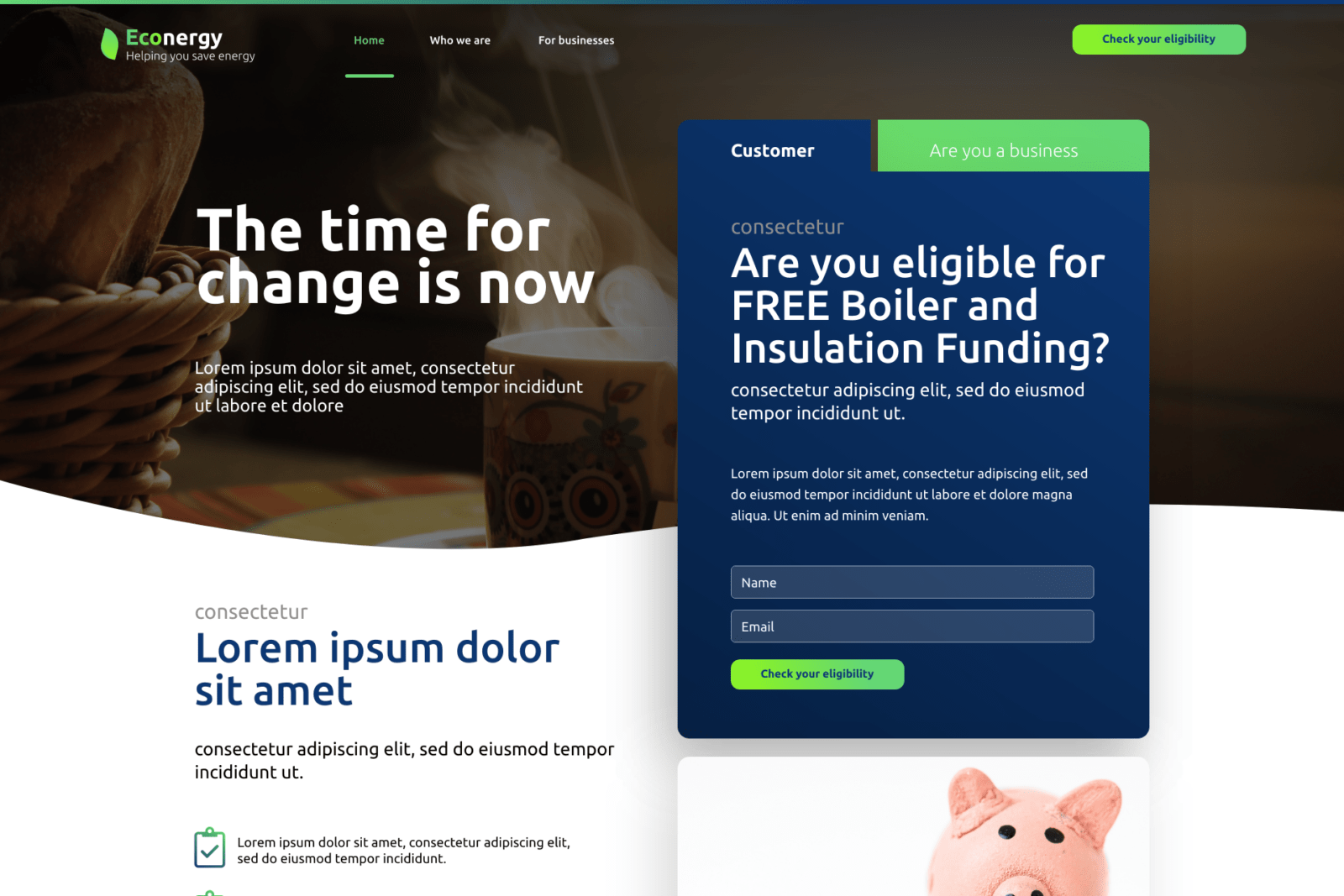
Accessible Brand and Logo
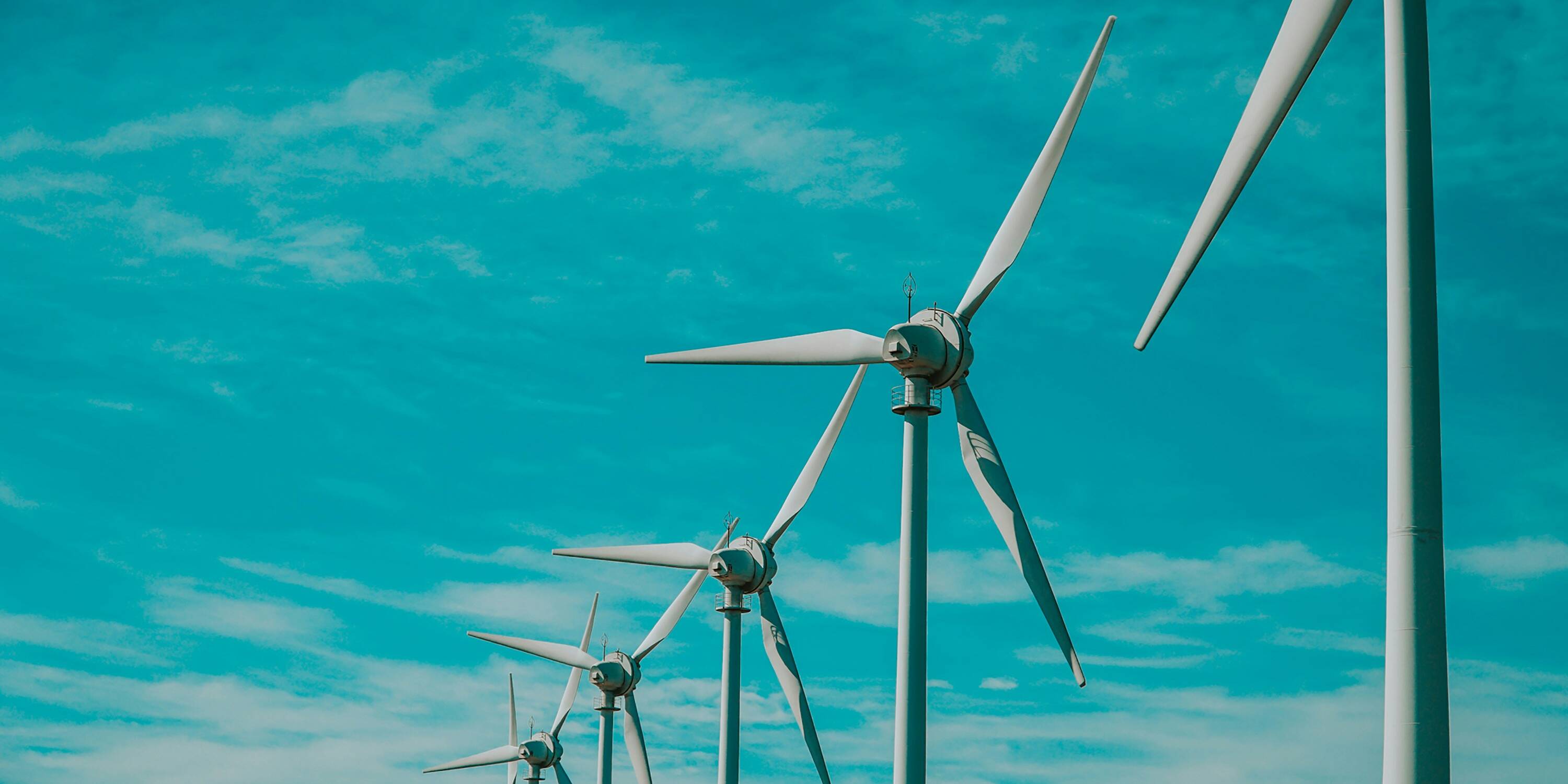
The project commenced with the creation of a brand identity and logo. The colour palette was carefully considered: green was chosen to evoke associations with clean and sustainable energy, blue to project a friendly and approachable image, and white to convey a sense of cleanliness and modernity. The design evolved iteratively, incorporating elements such as curved edges, subtle drop shadows, and clearly defined sections to enhance visual appeal and user comprehension. The overall aesthetic aimed to be both professional and reassuring, avoiding any design elements that might alienate the target audience. The concept of a warm and energy-efficient home subtly influenced the design direction.
02
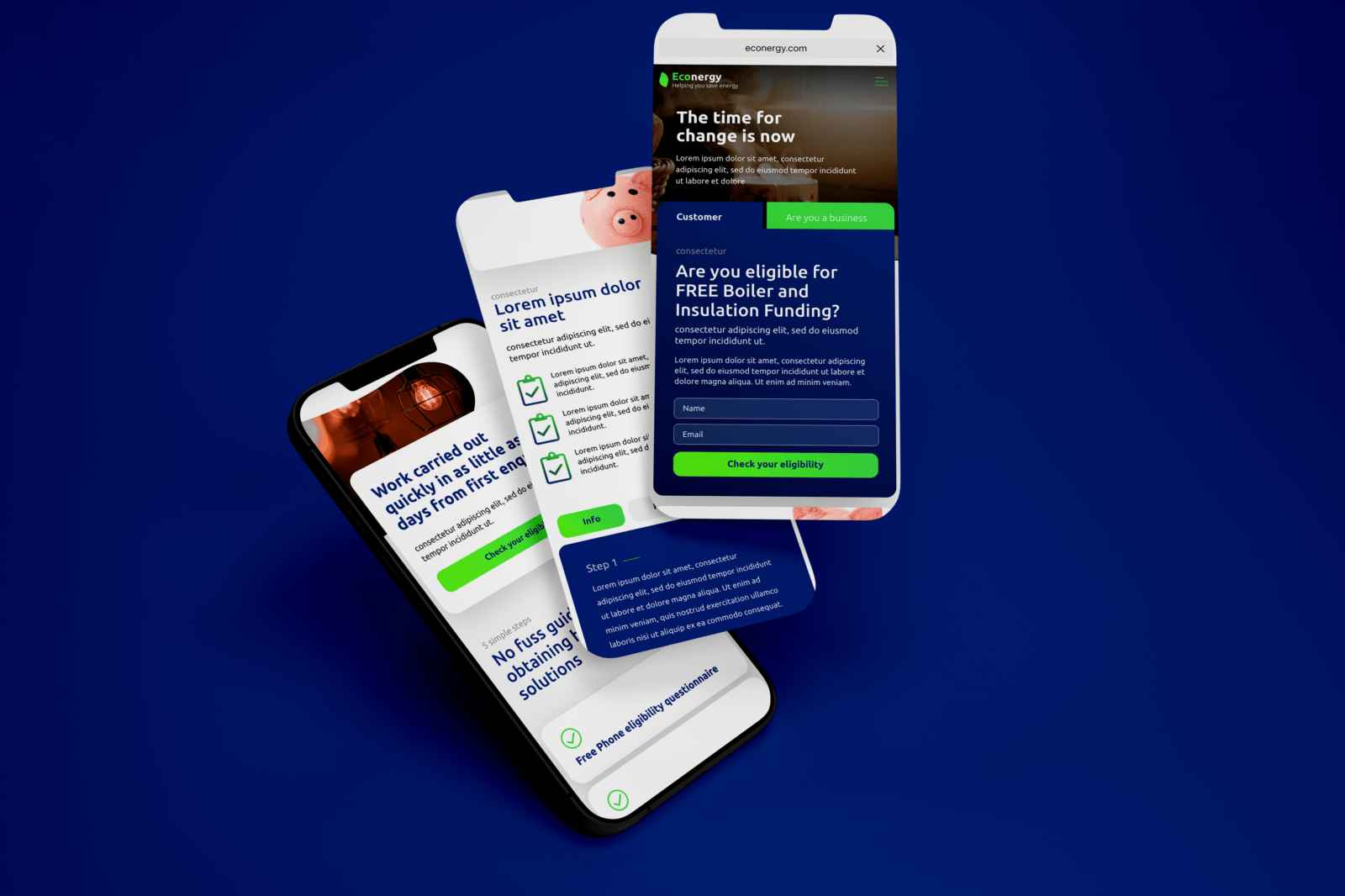
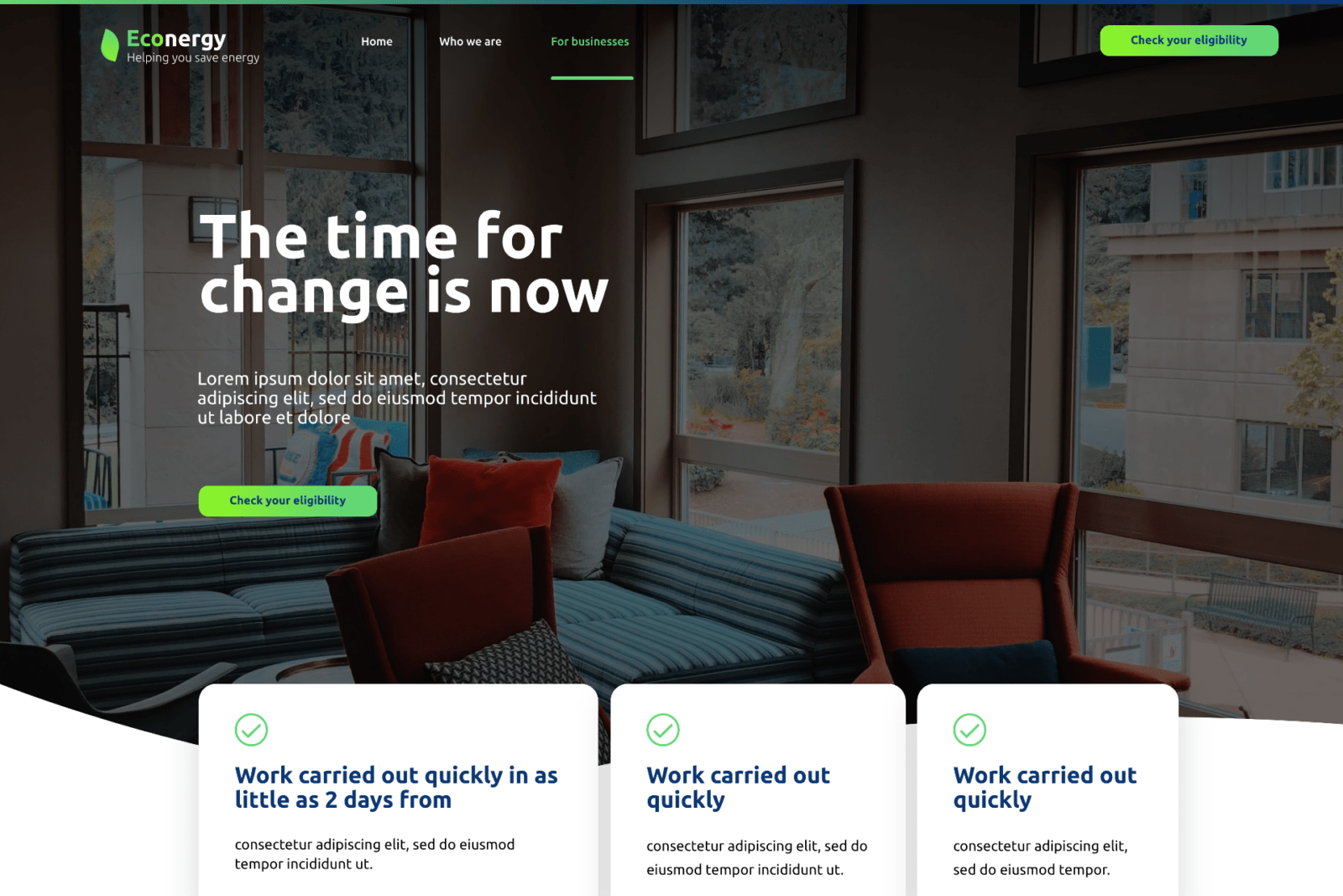
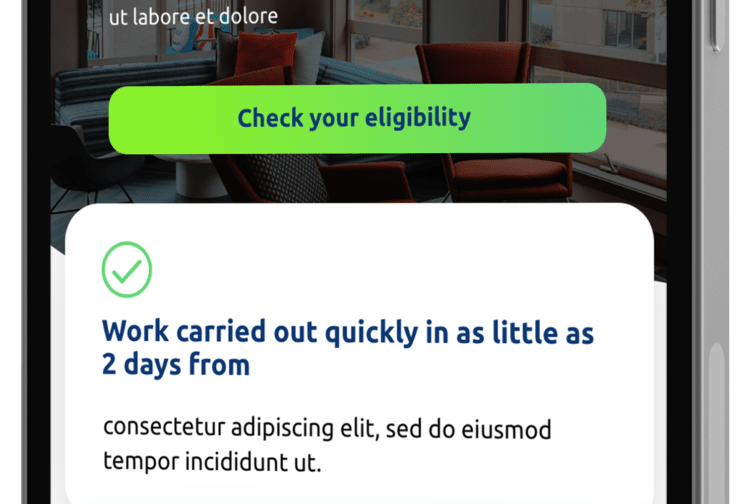
An Intuitive and Navigable Website
Accessibility and ease of navigation were paramount in the website’s design. To improve readability and comprehension, a strategic use of high and low colour contrast was employed to delineate blocks of text. The website’s functionality included a straightforward booking and sign-up process, preceded by an eligibility assessment. This assessment involved a simple three-step multiple-choice questionnaire designed for clarity and ease of interaction. To further enhance usability, helpful hints and tips were integrated alongside the questions, providing contextual guidance to users.
Outcomes and Demonstrated Capabilities.
Project Update
The collaborative effort on the Econergy project resulted in a digital platform tailored to the specific needs of its target audience:
An Accessible and User-Friendly Website: The design prioritised ease of use and navigation for older users, ensuring a positive and straightforward experience.
A Brand Identity Conveying Trust and Sustainability: The carefully chosen colours and design elements effectively communicated Econergy’s commitment to clean energy and a supportive approach.
A Streamlined Eligibility and Sign-Up Process: The intuitive three-step questionnaire with embedded hints facilitated a smooth and accessible booking and sign-up process.
A Design Informed by User Research: The design decisions were grounded in thorough market research and an understanding of the preferences and needs of the older generation.
This project highlights the ability to conduct targeted user research and translate those insights into accessible and effective design solutions for specific demographics. It also demonstrates successful collaboration with development partners to deliver a functional and user-centric digital product. The focus was on creating a website that was not only professional but also highly approachable and easy to use for its intended audience.

"4heron was great from start to finish of the process. He took the time to understand what the vision for my company website was, he then brought his experience and expertise to develop a concept that far exceeded the vision that I originally had. Even now, months after completing my website 4heron is still on hand to help whenever I have questions or need changes to my website. I would highly highly recommend 4heron for your next website."
Elliot NEOS Global Consulting