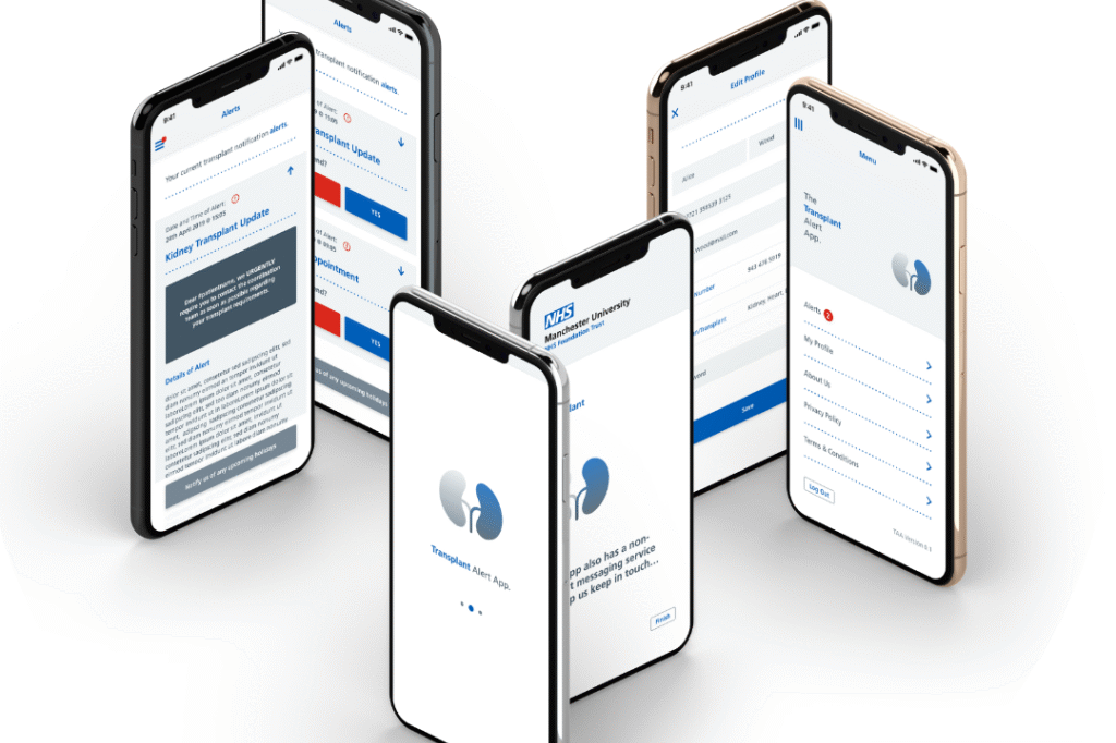
Building upon a successful partnership with Manchester University NHS Foundation Trust and TrusTech, the objective was to create the Transplant Alert App (TAA) and its associated CMS. This critical system was designed to significantly improve communication and coordination between the transplant coordination team and patients awaiting organ transplantation. The paramount goal was to ensure that no patient unnecessarily misses a transplant opportunity due to delayed communication, guaranteeing they are promptly notified and prepared should a compatible organ become available. A key feature of the app is its ability to deliver organ alerts that override silent and do-not-disturb settings on patients’ devices.
The Approach: User-Centric UI/UX Design and Agile Project Management for a Life-Saving Solution
My role in this vital project involved both the UI/UX design of the Transplant Alert App and the comprehensive project management throughout its development. Recognising the time-critical nature of organ transplantation, the design process focused on creating an exceptionally intuitive, efficient, and reliable interface for both the transplant team and patients. Simultaneously, a flexible, agile project management approach was implemented to navigate the specific requirements and ensure the timely delivery of a secure and user-validated solution. This involved close collaboration with medical professionals to deeply understand the communication workflows and the sensitive needs of transplant patients.
Client
Manchester University NHS Foundation Trust & TrusTech
Service
Content Strategy Design Development Mobile App CMS
Key Features and Implementation.
Intuitive UI/UX Design for Time-Sensitive Communication: The UI/UX design prioritised clarity and speed, ensuring that critical transplant alerts and essential information were immediately accessible and understandable for patients, even in potentially stressful situations. The interface for the transplant team within the CMS was designed for efficient communication and management of patient availability.
Enabling Critical Transplant Alerts: A core UI/UX challenge was the seamless integration of critical alerts that bypass device silence settings. The design ensured these alerts were prominent and easily distinguishable, guiding patients to crucial information without delay.
01
App Management Portal (CMS)
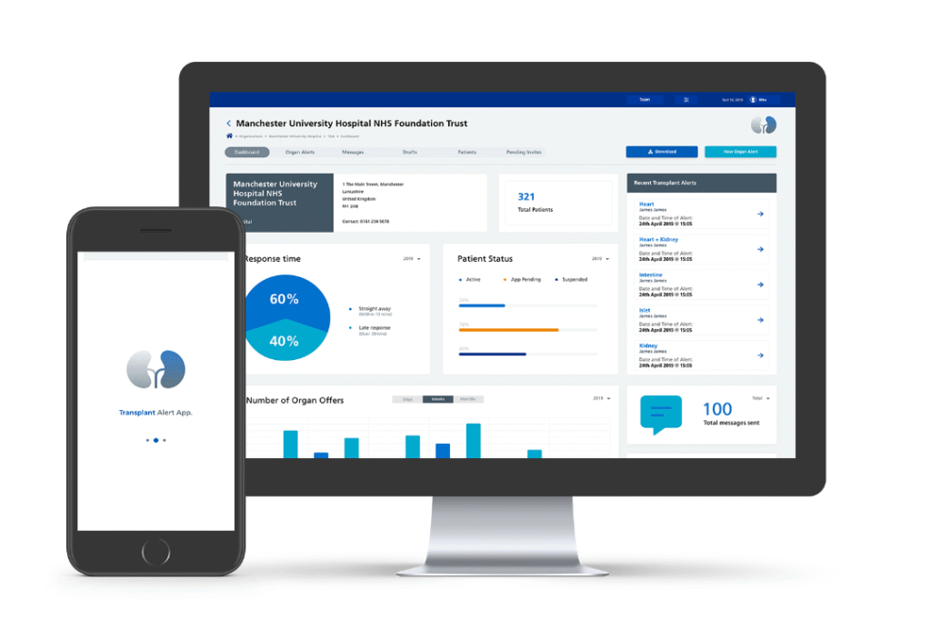
The CMS was designed with secure, invite-only access for the transplant team. Its UI/UX focused on providing clear audit trails, robust governance, and efficient dashboards for real-time and statistical data reporting related to transplant alerts and patient responses.
02
Branding and Visual Identity
The project included the complete branding of TAA, with the creative team developing various logo and brand theme options that reflected the app’s purpose and resonated with the sensitive nature of organ transplantation.
03
Onboarding and Data Security
The UI/UX design for patient onboarding prioritised simplicity and efficiency, requiring only essential information while adhering to GDPR compliance. Close collaboration with the Trust’s Information Governance Team ensured the secure handling of sensitive patient data, utilising NHS numbers for unique identification.
Outcomes and Demonstrated Capabilities.
Project Update
The Major Incident Transplant Alert App and CMS delivered a vital communication platform designed to improve the efficiency and timeliness of organ transplantation:
Intuitive and Urgent-Focused UI/UX: The application’s design ensured rapid comprehension and response to critical transplant alerts for patients.
Secure and Efficient CMS for Transplant Team Management: The CMS provided a robust and user-friendly interface for managing patient data, sending alerts, and tracking responses.
Successful Implementation of Critical Alert Bypass: The UI/UX effectively integrated the critical alert functionality, overcoming device limitations to ensure patients receive timely notifications.
Effective Stakeholder Collaboration and Agile Delivery: Agile project management facilitated close collaboration with the client and medical professionals, ensuring the solution directly addressed their critical needs.
User-Validated Design for a Sensitive Context: Iterative prototyping and thorough UAT ensured a user-friendly and reliable application for transplant patients.
Prioritisation of Data Security and GDPR Compliance: The UI/UX design and project management adhered to strict data security and privacy regulations.
This project underscores the ability to lead both the UI/UX design and project management for highly sensitive and time-critical healthcare applications. The focus was on creating an intuitive and reliable user experience for both medical professionals and patients in life-saving situations, combined with a meticulous and collaborative project management approach to ensure the successful delivery of a vital communication tool.


